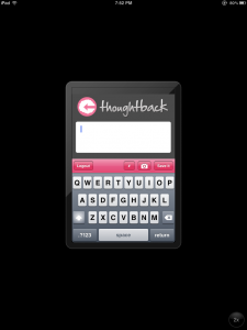
 Running an iPhone app on an iPad isn’t the best experience. It doesn’t use the iPad keyboard and everything looks very pixelated. Ideally, you would build an iPad version of your app, but that’s not always worthwhile. The iPad is a very different beast than the iPhone and it usually involves creating a completely unique experience for your app. So how can you make your iPhone app look better on an iPad?
Images. With the iPhone 4, Apple introduced an image naming schema that would allow you to load large images for the retina display and small ones for devices without it.
When the iPad launches an iPhone app, it launches it at the original iPhone resolution of 320×480. When you press the 2x button on the iPad it will stretch it out to 640×960 (the same resolution as the retina display).
This stretching, makes everything double in size and it all looks pixelated. So if you have an image that is 100 pixels wide, it will become 200 pixels wide and look like crap. But what happens if the image you provide is already 200 pixels wide?
It turns out that it looks pretty good. It shows up at the correct resolution with no pixelation.
The only problem with this is that if you give it a low res image, it will load it. Then it stretches and looks like crap. What you need to do is forget about the low res images and just include hi-res images.
“Won’t it look bad on the iPhone 3GS?” No. It’ll look fine. It’s scaling by half. Even the most rudimentary scaling algorithms look fine when it’s perfectly halved. You might lose a little bit of detail on some images, but it’s not much more detail than you’d lose using Photoshop to scale the images. Nobody will notice.
You can use the @2x naming convention if you want to, the images will all load just fine. There is a bug in Xcode 4’s interface builder that causes it to fail to load the images unless you put the @2x in the image name. This used to work in Xcode 3 before.
Including 2 images now is kind of silly. It makes the app larger (which can prevent you from downloading over 3G) and adds extra files that you need to manage. It’s easy to misname an image and end up with a pixelated piece of crap on your phone. The large images look just fine on the low res screens. I promise. It’s really too bad that iOS doesn’t render an iPhone app at the larger resolution on the iPad. It already knows how to draw the app at the double resolution for the retina display. Maybe with iOS 6.0.


That is a nifty trick to keep any images used in the app from distorting @2x on an iPad, but what about stretched out text? Also, the keyboard used is still a stretched iPhone keyboard.
The only way to fix the keyboard and text is to make it a universal app.